BAPE
A Mobile App for Japan Streetwear Brand, BAPE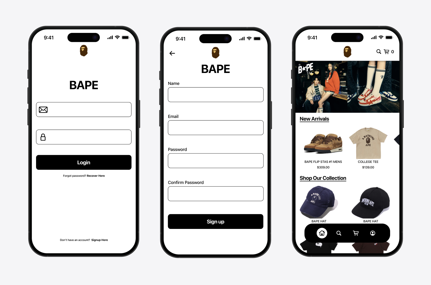
Overview
As someone who grew up loving BAPE, I always wondered why one of the most iconic streetwear brands never had a dedicated mobile app. While brands like Supreme have embraced mobile platforms to engage their community and boost accessibility, BAPE has remained web-only. This project explores the concept of a BAPE mobile app—designed to align closely with the brand's existing aesthetic while offering a more convenient shopping experience. The app brings BAPE's bold visuals and product-forward design into a mobile-friendly format, allowing users to browse new arrivals, explore collections, and shop seamlessly without needing to navigate a desktop website. By introducing an app, BAPE could open new avenues for sales, improve customer engagement, and meet the expectations of a mobile-first audience.
View prototypeThe Challenge
How might we create a seamless mobile shopping experience for BAPE customers that reflects the brand's iconic aesthetic while increasing accessibility and sales?
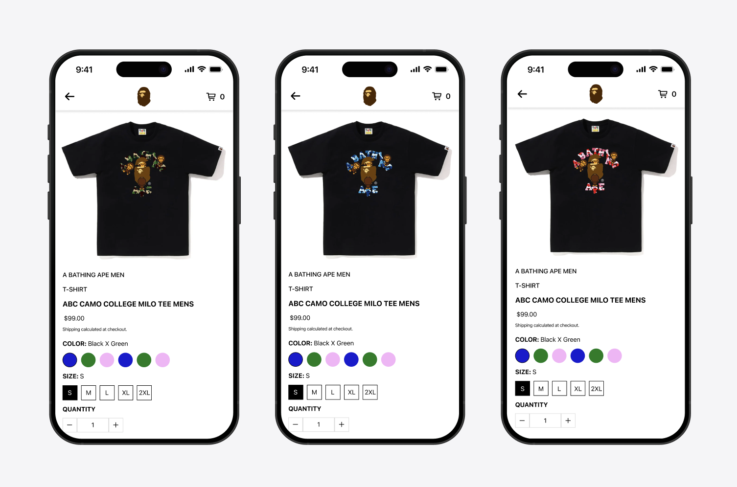
This product page was designed with a swipeable interface to allow users to easily browse through different color variations without leaving the product screen—creating a more fluid and mobile-friendly shopping experience. The layout emphasizes clarity and minimalism, mirroring BAPE's existing visual identity. Key actions like size selection, color options, and quantity adjustments are kept easily accessible and touch-optimized, making the purchase flow intuitive. The focus on large imagery and bold product visuals ensures users can clearly see design details, reinforcing the brand's streetwear appeal while streamlining the mobile shopping journey.
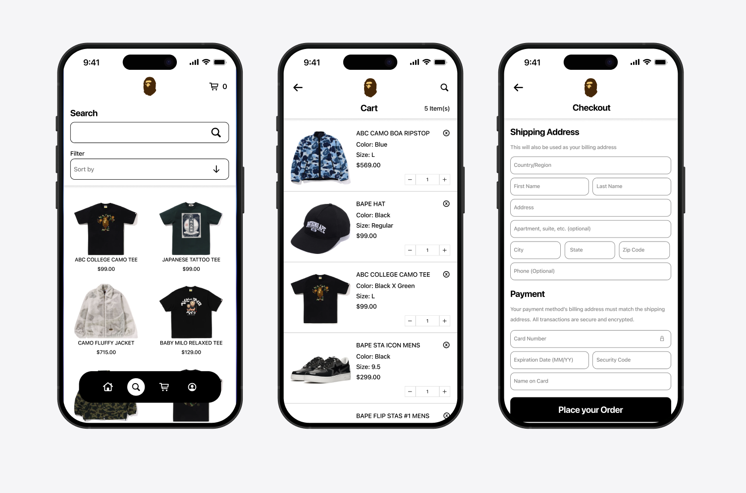
This interface focuses on creating a smooth end-to-end shopping flow—from browsing to checkout. The search screen includes intuitive filtering and sorting options, allowing users to quickly find specific items within BAPE's diverse catalog. The cart interface uses a clean, scrollable layout with clear product thumbnails, sizes, and quantity controls for easy editing. The checkout screen is designed with minimal friction in mind, using simplified form fields and a clear call-to-action at the bottom to guide users through the payment process. The overall layout maintains brand consistency while prioritizing usability and clarity, ensuring a fast and seamless mobile shopping experience.